I worked with the talented folks at ACG Brands to help create a new brand identity for True. I refined their existing brand mark, created a custom logotype, gave them a new and bold color way as well as a packaging system that would pop off the shelf.
True creates tools for everyday triumphs. Working with your hands stimulates the mind and satisfies the soul. True’s goal is to put purpose back into your hands.
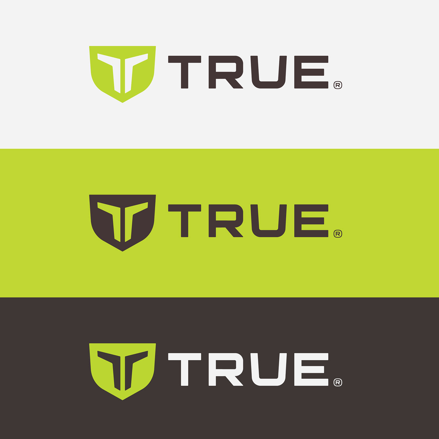
The True brand mark is punctuated with its distinctive shield icon. Featured in the bright yellow-green, it showcases a “T” formed from two stylized folded blades.
I worked with Ron and Garrett at True. Those guys are amazing. I love the photography they created for the system. I also love the custom “R-Ball” they created for the logo based on the unique “R” in the logotype. It’s little details like this that set the standard of design quality for the rest of the brand identity system.
ACG Brand Team:
Sr. CD: Ron Way
Sr. AD: Garrett Brzozowski